
Mobile App Design Project
Mobile App Design Project
Mobile App
🇹🇭 Thai AgriTech
🇹🇭 Thai AgriTech
Accessibility
Accessibility
Onboarding Design
Onboarding Design
UI Design
UI Design
User Research
User Research
Design System
Design System
Prototyping
Prototyping

01. Context
A Trade Crisis That Made Traceability Mandatory
A Trade Crisis That Made Traceability Mandatory
$4B in exports at risk because no one could prove what was on the farm.
$4B in exports at risk because no one could prove what was on the farm.
Thailand supplies ~90% of the world's durian, generating over $4B USD annually. The supply chain relied heavily on paper-based records and manual tracking.
When China detected a banned carcinogenic dye (BY2) in Thai shipments, it mandated 100% container inspection overnight. Over 100 containers were rejected. 500 million baht in losses. The message was immediate: no verified record, no export.
GreenPassport was built to fix this as a digital farm log that meets ThaiGAP certification requirements. The challenge: the farmers who need it most are over 58, with little to no digital experience.
Year
2026
Category
🇹🇭 Thai AgriTech
Role
UI/UX Designer ✧ Design Team of 3
Cross-functional team
01 PM ✧ 3 BA ✧ 3 ENGINEER ✧ 3 QA
Status
MVP ✧ 3 Months ✧ 4 Core Features


Meet Rin.
Your Farm Starts Here.
Meet Rin.
Your Farm Starts Here.
Rin is present from screen one, a loyal companion, not a tutorial guide.
Designing trust from the very first screen, onboarding elder Thai farmers into the digital age.
GreenPassport is Thailand's digital agriculture traceability platform built in direct response to a national export crisis. China began rejecting Thai durian shipments over unverifiable supply chains. The fix required every farmer to have a certified digital record.
My role: designing the first-touch experience that brings elder farmers into the app, including onboarding, login, sign-up, and walkthrough flows.


02. MVP OVERVIEW
One Platform, Four Features, Three Months
One Platform, Four Features, Three Months
The MVP scope was defined by the team. Each feature was assigned to a designer.
The MVP scope was defined by the team. Each feature was assigned to a designer.
GreenPassport MVP launched with four core features, each one solving a real problem Thai durian farmers face every season. Not social media. Not generic tools. Built specifically for the way farmers work.
⤷
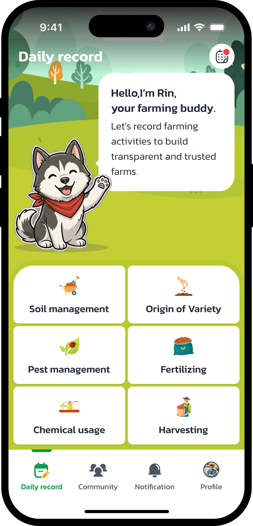
Daily Record
Daily Record
Not a notebook, a legal record. Log activities with photos and timestamps. Permanently stored, exportable, and accepted for ThaiGAP certification.
Not a notebook, a legal record. Log activities with photos and timestamps. Permanently stored, exportable, and accepted for ThaiGAP certification.


⤷
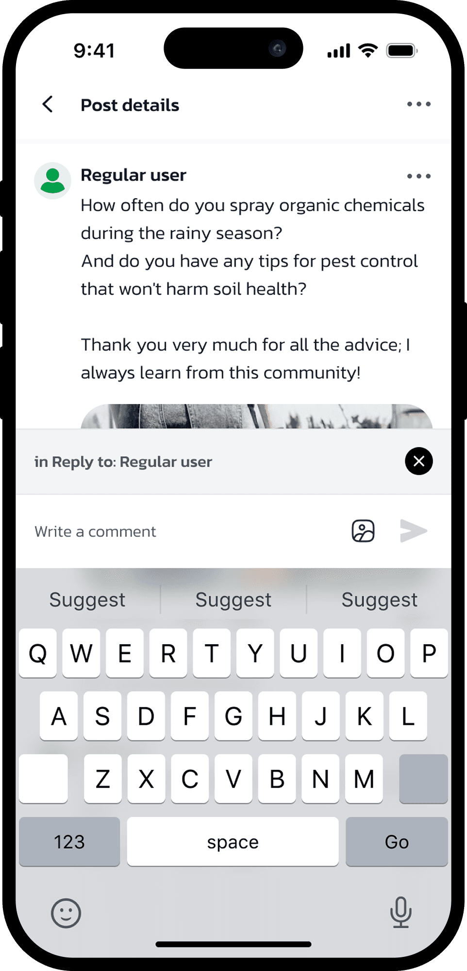
Community
Community
Not Facebook, a farming community. Seasonal pricing, weather alerts, pest warnings, durian tips filtered by crop and region. No noise.
Not Facebook, a farming community. Seasonal pricing, weather alerts, pest warnings, durian tips filtered by crop and region. No noise.

⤷
Notification
Notification
Not spam, timely farm intelligence. Reminders to log today's work, weather alerts, and export certification updates. All in one place.
Not spam, timely farm intelligence. Reminders to log today's work, weather alerts, and export certification updates. All in one place.


⤷
Profile
Profile
Not a social profile, a digital farm passport. Farm size, crop history, location, and ThaiGAP status all verifiable by buyers before a single container is loaded.
Not a social profile, a digital farm passport. Farm size, crop history, location, and ThaiGAP status all verifiable by buyers before a single container is loaded.


✦ Foundational First-Touch Layer
✦ Foundational First-Touch Layer
Before a farmer ever reaches the four core features, they pass through four flows I owned entirely. These flows determine whether a new user stays or abandons. Every retention metric downstream depends on getting this foundational layer right.
Before a farmer ever reaches the four core features, they pass through four flows I owned entirely. These flows determine whether a new user stays or abandons. Every retention metric downstream depends on getting this foundational layer right.
Onboarding flow
Value prop - Rin intro
Login
Plain copy · Zero friction
Sign Up
11→6 fields · LINE OTP
Walkthrough
Rin as guide · 4 moments
Onboarding flow
Onboarding flow
Value prop - Rin intro
Login
Login
Plain copy · Zero friction
Sign Up
Sign Up
11→6 fields · LINE OTP
Walkthrough
Walkthrough
Rin as guide · 4 moments
03. PROBLEM & CHALLENGE
The Real Challenges Were Human, Not Technical
The Real Challenges Were Human, Not Technical
The business problem was clear: Farmers needed to digitize fast or lose export access. The design problem was harder.
The business problem was clear: Farmers needed to digitize fast or lose export access. The design problem was harder.
Business Problem
No Digital Record, No Export
The BY2 scandal triggered a new legal requirement: every Thai durian farm must register with the Department of Agriculture and maintain certified ThaiGAP daily activity logs to qualify for export.
The target users are elderly farmers, average age: 58, low digital literacy, and now forced to adopt a digital tool. GreenPassport had to be so easy that a farmer who had never used a smartphone app could complete registration and start logging on day one.
On top of this two structural process challenges shaped how we designed, and when.
Process Challenge
Constant Scope Creep from the Thai PO
The Product Owner on the Thai side frequently revised requirements mid-sprint. Features that were 'finalized' would reappear with new conditions, new target audiences, or entirely different directions.
Designs we had already moved to high-fidelity had to be revisited and rebuilt often without additional time being added to the timeline.
"The walkthrough was originally 3 steps. After delivery, PO added 2 more steps and changed the mascot from a static icon to an animated character one week before handoff."
Collaboration Challenge
High-Level Briefs, Zero Business Goals Upfront
The Business Analyst consistently delivered vague, high-level ideas without defined business goals, success metrics, or user requirements.
Without a clear problem statement, design decisions had to be grounded in our own user research and domain knowledge. In a reversed workflow, the BA would later adjust their documentation based on the designs we produced, making the design output the source of truth rather than the brief.
"Brief received: Make an onboarding that is friendly for farmers. No persona. No success metric. No content guidance. We designed first, wrote the spec ourselves, then the BA adopted it."
Business Problem
No Digital Record, No Export
The BY2 scandal triggered a new legal requirement: every Thai durian farm must register with the Department of Agriculture and maintain certified ThaiGAP daily activity logs to qualify for export.
The target users are elderly farmers, average age: 58, low digital literacy, and now forced to adopt a digital tool. GreenPassport had to be so easy that a farmer who had never used a smartphone app could complete registration and start logging on day one.
On top of this two structural process challenges shaped how we designed, and when.
Process Challenge
Constant Scope Creep from the Thai PO
The Product Owner on the Thai side frequently revised requirements mid-sprint. Features that were 'finalized' would reappear with new conditions, new target audiences, or entirely different directions.
Designs we had already moved to high-fidelity had to be revisited and rebuilt often without additional time being added to the timeline.
"The walkthrough was originally 3 steps. After delivery, PO added 2 more steps and changed the mascot from a static icon to an animated character one week before handoff."
Collaboration Challenge
High-Level Briefs, Zero Business Goals Upfront
The Business Analyst consistently delivered vague, high-level ideas without defined business goals, success metrics, or user requirements.
Without a clear problem statement, design decisions had to be grounded in our own user research and domain knowledge. In a reversed workflow, the BA would later adjust their documentation based on the designs we produced, making the design output the source of truth rather than the brief.
"Brief received: Make an onboarding that is friendly for farmers. No persona. No success metric. No content guidance. We designed first, wrote the spec ourselves, then the BA adopted it."
How we responded
✅ Anchored every decision in user research, not opinion. Research insights helped us defend user-centered decisions during frequent scope changes.
✅ Anchored every decision in user research, not opinion. Research insights helped us defend user-centered decisions during frequent scope changes.
✅ Established a modular Design System early so scope changes could be absorbed without full rebuilds.
✅ Established a modular Design System early so scope changes could be absorbed without full rebuilds.
✅ Self-defined success metrics for each feature before starting. Used them to push back on changes that undermined user goals.
✅ Self-defined success metrics for each feature before starting. Used them to push back on changes that undermined user goals.

05. MY CONTRIBUTION - DEEP DIVE
The Four Flows
Every interaction below was researched, designed, and iterated by me.
Onboarding Flow
Onboarding Flow
Login
Login
Sign Up
Sign Up
Walkthough & Tutorial
Walkthough & Tutorial
Onboarding Flow
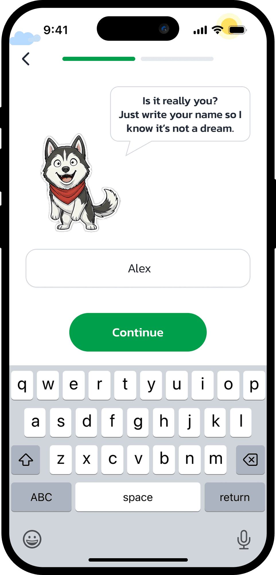
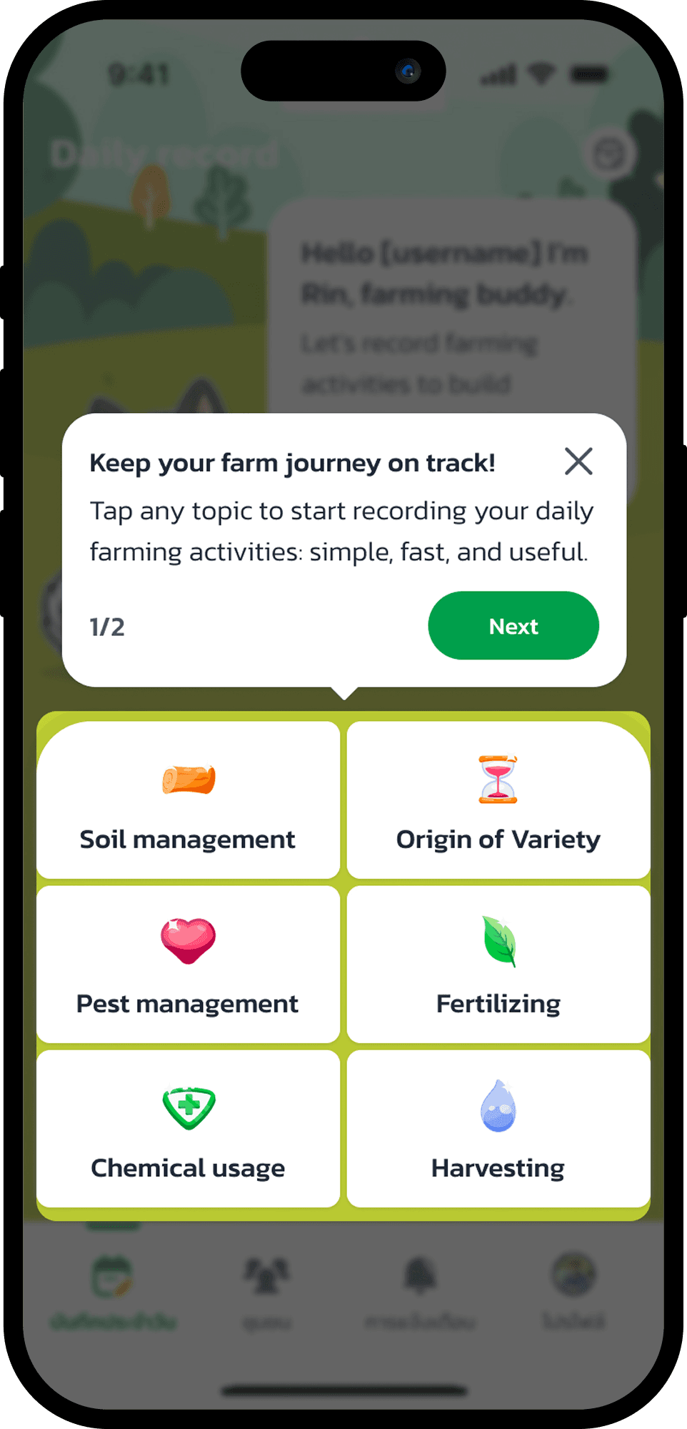
One job: show value before asking anything. Four screens Splash, Track, Connect, Never miss one message each. Rin appears from the start as a familiar presence, not an instructor. No forms yet. Just enough to make them tap Continue.
⤷
Research & Persona Validation
Interviewed elder farmers in Chanthaburi. Key insight: farmers trust faces and characters not icons.
⤷
Content Architecture
4 screens: Splash → Track → Connect → Never miss. One message, one visual, one CTA each. Friction deferred to Sign Up.
⤷
Mascot Design: Meet Rin
Rin is present from screen one a loyal companion, not a tutorial guide. Trustworthy, warm, never overwhelming.
⤷
Usability Testing & Iteration
"Continue" CTA was missed on first tap by most farmers. Iterated to full-width, high-contrast button 0/8 missed it in retest.


05. MY CONTRIBUTION - DEEP DIVE
The Four Flows
Every interaction below was researched, designed, and iterated by me.
Onboarding Flow
Onboarding Flow
Login
Login
Sign Up
Sign Up
Walkthough & Tutorial
Walkthough & Tutorial
Onboarding Flow
One job: show value before asking anything. Four screens Splash, Track, Connect, Never miss one message each. Rin appears from the start as a familiar presence, not an instructor. No forms yet. Just enough to make them tap Continue.
⤷
Research & Persona Validation
Interviewed elder farmers in Chanthaburi. Key insight: farmers trust faces and characters not icons.
⤷
Content Architecture
4 screens: Splash → Track → Connect → Never miss. One message, one visual, one CTA each. Friction deferred to Sign Up.
⤷
Mascot Design: Meet Rin
Rin is present from screen one a loyal companion, not a tutorial guide. Trustworthy, warm, never overwhelming.
⤷
Usability Testing & Iteration
"Continue" CTA was missed on first tap by most farmers. Iterated to full-width, high-contrast button 0/8 missed it in retest.


05. MY CONTRIBUTION - DEEP DIVE
The Four Flows
Every interaction below was researched, designed, and iterated by me.
Onboarding Flow
Onboarding Flow
Login
Login
Sign Up
Sign Up
Walkthough & Tutorial
Walkthough & Tutorial
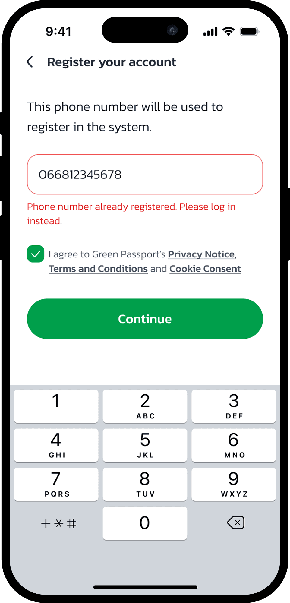
Sign Up Flow
One rule: ask as little as possible. Phone number only no name, no farm details upfront. OTP verifies. PIN replaces passwords. Most elder farmers complete it without asking for help.
⤷
Field Reduction
Single input: phone number. Everything else deferred to Profile setup after first login. 6/8 farmers completed registration without asking for help.
⤷
Trust Signals
T&C surfaced as a required modal not fine print. Microcopy in plain language: "This phone number will be used to register in the system." No legal jargon.
⤷
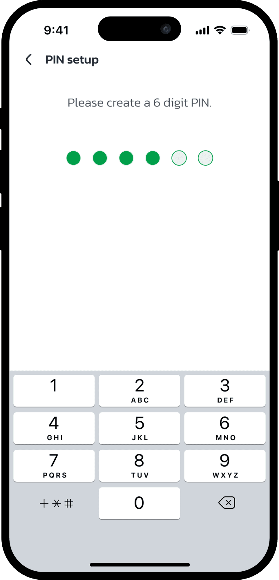
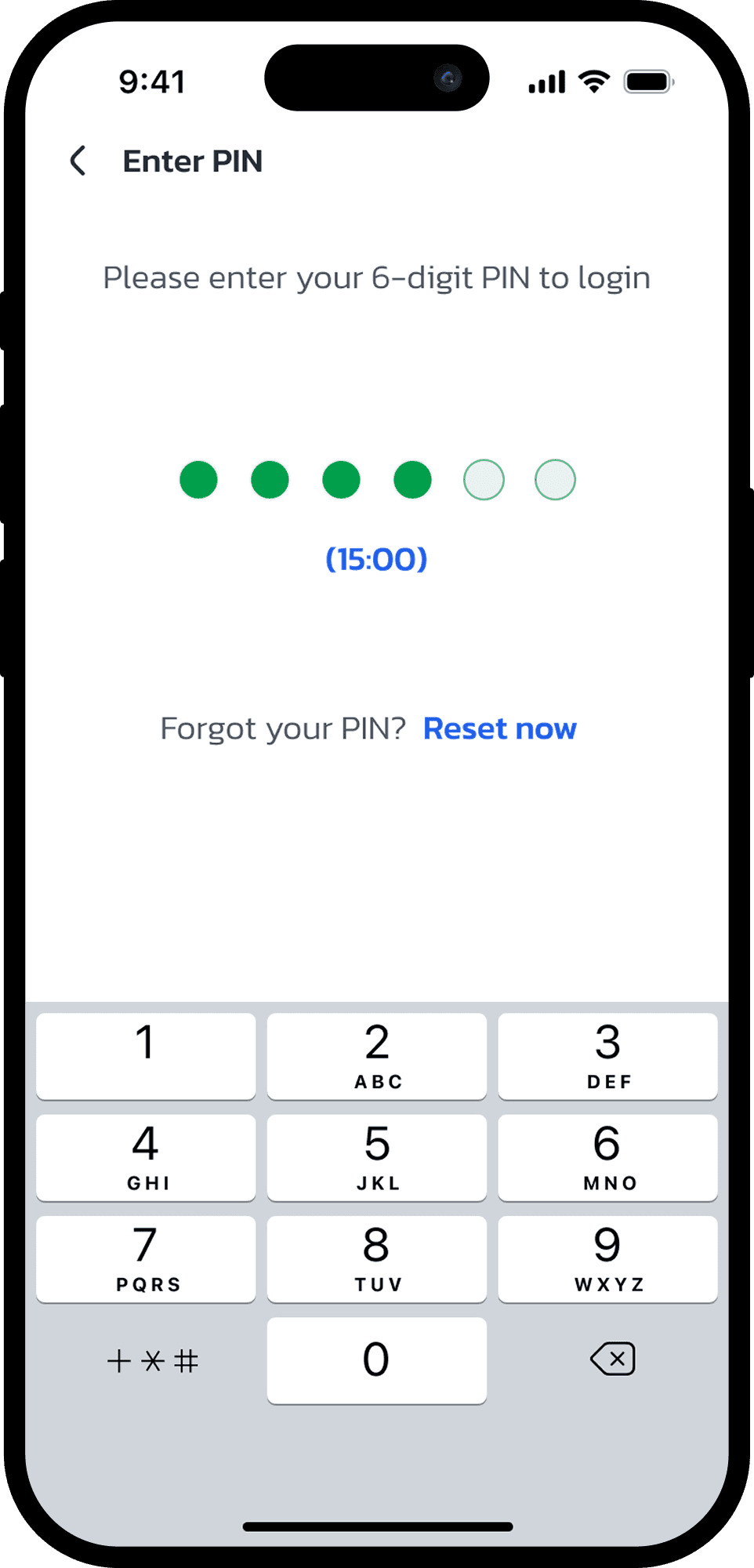
OTP → PIN Flow
SMS OTP with auto-fill support. Followed immediately by PIN setup one session, no return visits required. Success screen confirms with a clear welcome message.
05. MY CONTRIBUTION - DEEP DIVE
The Four Flows
Every interaction below was researched, designed, and iterated by me.
Onboarding Flow
Onboarding Flow
Login
Login
Sign Up
Sign Up
Walkthough & Tutorial
Walkthough & Tutorial
Onboarding Flow
One job: show value before asking anything. Four screens Splash, Track, Connect, Never miss one message each. Rin appears from the start as a familiar presence, not an instructor. No forms yet. Just enough to make them tap Continue.
⤷
Research & Persona Validation
Interviewed elder farmers in Chanthaburi. Key insight: farmers trust faces and characters not icons.
⤷
Content Architecture
4 screens: Splash → Track → Connect → Never miss. One message, one visual, one CTA each. Friction deferred to Sign Up.
⤷
Mascot Design: Meet Rin
Rin is present from screen one a loyal companion, not a tutorial guide. Trustworthy, warm, never overwhelming.
⤷
Usability Testing & Iteration
"Continue" CTA was missed on first tap by most farmers. Iterated to full-width, high-contrast button 0/8 missed it in retest.
04. TARGET AUDIENCE
Designing for Thailand's Elder Farmers
GreenPassport serves farmers across a wide spectrum of digital literacy. Every design decision was anchored to the primary user if Somchai can do it, everyone can.
✦ Primary User · Traditional Elder Farmer
👨🌾 สมชาย (Somchai)
Age 62 · Chanthaburi · Very Low Digital Literacy
Most changes came from unclear upfront alignment. I learned to ask for sign-off at every milestone not to be bureaucratic, but to create shared accountability before pixels are made.
Pain Point
· Cannot read small text
· Afraid of pressing the wrong button
· Doesn't like typing
· Distrusts apps that don't respond quickly
Goals
· Record activities simply
· Trust that data is saved
· Avoid complicated steps
· Keep export certification valid
UX Needs
Large text & icons
Real-time feedback
Minimal steps
Clear navigation
Mascot guidance (Rin)
Secondary User · Tech/Engineer Farmer
👨💻 ช่อลัก (Krit)
Age 29 · Pathum Thani · High Digital Literacy
A former engineer running a smart durian farm with automation and sensors. Wants data dashboards, analytics, and deeper control over farm records.
UX Needs
Data depth
Analytics dashboard
Export records
Configurable modules
Tertiary User · Young Smart Farmer
👩🌾 ไนท์คลับ (Nattapong)
Age 34 · Chiang Mai · Medium-High Digital Literacy
Took over the family farm and wants to improve by tracking patterns across seasons. Uses Facebook farming groups and YouTube daily. Open to guided onboarding, values history and seasonal comparison.
UX Needs
History view
Seasonal comparison
Task progress
Guided onboarding
06. DESIGN VALIDATION
What Testing Showed
What Testing Showed
Validated via closed beta on TestFlight 12 recruited farmers in Chanthaburi & Surat Thani, 3-week observation period prior to public launch (April 2026).
Validated via closed beta on TestFlight 12 recruited farmers in Chanthaburi & Surat Thani, 3-week observation period prior to public launch (April 2026).
"The walkthrough was originally 3 steps. After delivery, PO added 2 more steps and changed the mascot from a static icon to an animated character one week before handoff."
Sign Up
6/8 farmers completed registration without asking for help. T&C modal surfaced inline resolved unexpected-popup confusion in earlier iterations.
Issue: In early iterations, the T&C modal appeared unexpectedly after tapping Continue farmers thought they had made an error.
Fix: Surfaced T&C as an inline checkbox before the Continue button. Unexpected-popup confusion eliminated.
Result: 6/8 farmers completed registration without asking for help.
Onboarding flow
CTA button missed by 5/8 farmers in v1. After iterating to full-width high-contrast button 0/8 missed it in retest.
Issue: CTA button was missed by 5/8 farmers in v1 too small, low contrast.
Fix: Iterated to full-width, high-contrast button.
Result: 0/8 missed it in retest.
Issue: CTA button was missed by 5/8 farmers in v1 too small, low contrast.
Fix: Iterated to full-width, high-contrast button.
Result: 0/8 missed it in retest.

Login
7/8 farmers completed Phone → OTP → PIN without assistance. Friction point: farmers expected a keyboard for PIN resolved by switching to large numpad.
Issue: Farmers expected a keyboard for PIN input not a numpad.
Fix: Switched to large numpad layout, matching familiar ATM behaviour.
Result: 7/8 farmers completed Phone → OTP → PIN without assistance.


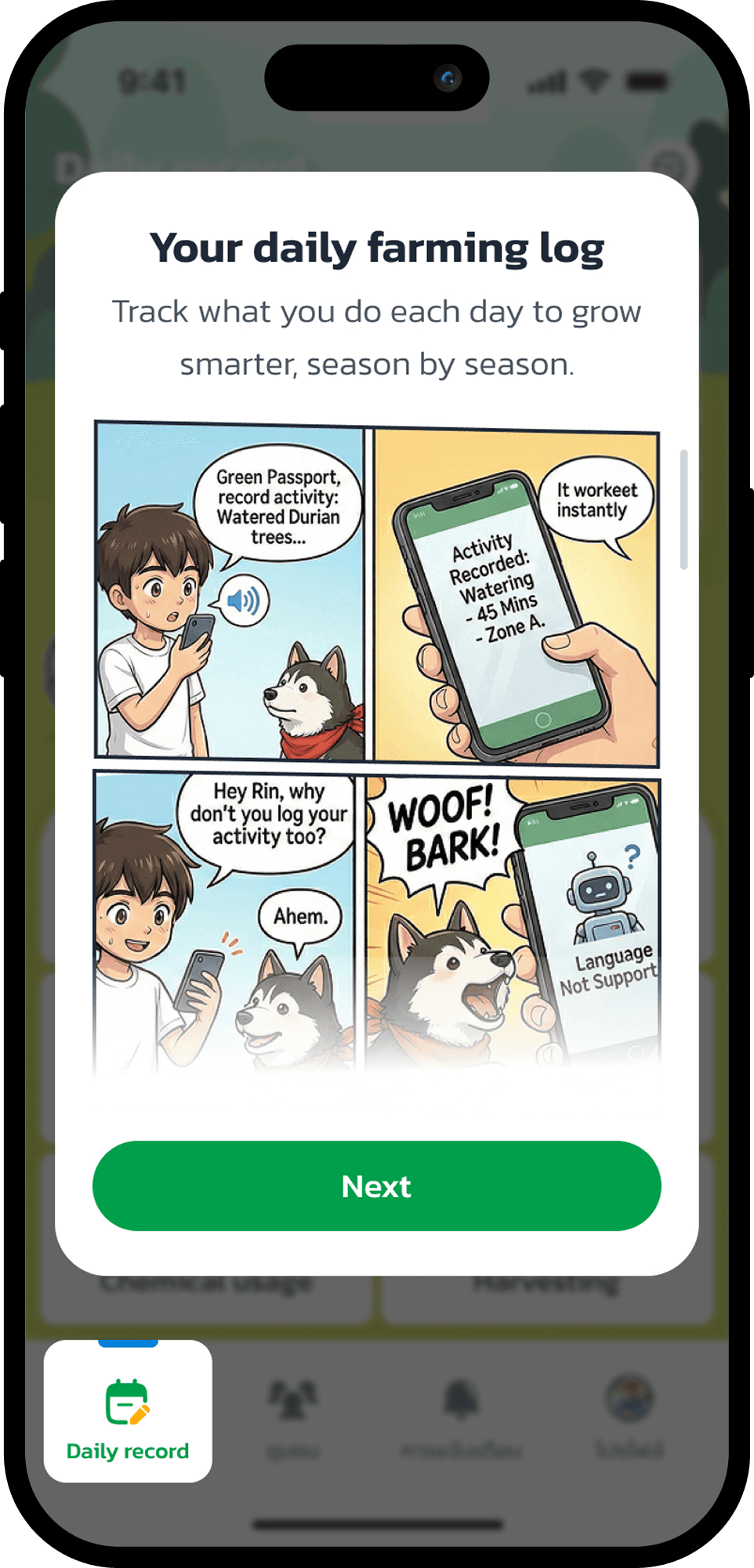
Walkthrough
Farmers who completed the walkthrough needed significantly less help during first Daily Record entry vs. those who skipped. In post-session feedback, 10 out of 12 farmers rated the tutorial as easy to understand.
Issue: Without guidance, farmers struggled during first Daily Record entry.
Fix: Walkthrough introduces key actions via comic panels, then interactive tooltips.
Result: Farmers who completed it needed significantly less help. 10/12 rated the tutorial easy to understand.
Issue: Without guidance, farmers struggled during first Daily Record entry.
Fix: Walkthrough introduces key actions via comic panels, then interactive tooltips.
Result: Farmers who completed it needed significantly less help. 10/12 rated the tutorial easy to understand.


Sign Up
Issue: In early iterations, the T&C modal appeared unexpectedly after tapping Continue farmers thought they had made an error.
Fix: Surfaced T&C as an inline checkbox before the Continue button. Unexpected-popup confusion eliminated.
Result: 6/8 farmers completed registration without asking for help.
Onboarding flow
Issue: CTA button was missed by 5/8 farmers in v1 too small, low contrast.
Fix: Iterated to full-width, high-contrast button.
Result: 0/8 missed it in retest.
Login
Issue: Farmers expected a keyboard for PIN input not a numpad.
Fix: Switched to large numpad layout, matching familiar ATM behaviour.
Result: 7/8 farmers completed Phone → OTP → PIN without assistance.
Walkthrough
Issue: Without guidance, farmers struggled during first Daily Record entry.
Fix: Walkthrough introduces key actions via comic panels, then interactive tooltips.
Result: Farmers who completed it needed significantly less help. 10/12 rated the tutorial easy to understand.
07. Lessons Learned
What This Project Taught Me
What This Project Taught Me
Three months, two process breakdowns, one dog, and four lessons I'll carry forever.
Three months, two process breakdowns, one dog, and four lessons I'll carry forever.

Research is your best defence against chaos
Research is your best defence against chaos
01
When requirements kept shifting, research data was the one thing that couldn't be argued with. I learned to document testing insights not just for knowledge but as a shield for every design decision.
When requirements kept shifting, research data was the one thing that couldn't be argued with. I learned to document testing insights not just for knowledge but as a shield for every design decision.
Emotional design isn't a nice-to-have it's the product
Emotional design isn't a nice-to-have it's the product
02
Rin started as a small brand detail. By the end, Rin was the reason farmers completed the tutorial. For users with technology anxiety, emotional design isn't decoration it's the core UX strategy.
Rin started as a small brand detail. By the end, Rin was the reason farmers completed the tutorial. For users with technology anxiety, emotional design isn't decoration it's the core UX strategy.
Scope creep is a communication failure, not a design failure
Scope creep is a communication failure, not a design failure
03
Most changes came from unclear upfront alignment. I learned to ask for sign-off at every milestone not to be bureaucratic, but to create shared accountability before pixels are made.
Most changes came from unclear upfront alignment. I learned to ask for sign-off at every milestone not to be bureaucratic, but to create shared accountability before pixels are made.
Designing modularly saves you when everything else breaks
Designing modularly saves you when everything else breaks
04
When the mascot was upgraded from static to animated, we updated one component not 24 screens. The Design System was the single decision that consistently saved time under pressure.
When the mascot was upgraded from static to animated, we updated one component not 24 screens. The Design System was the single decision that consistently saved time under pressure.

RIN WANTS YOU TO SEE THE DESIGN SYSTEM
RIN WANTS YOU TO SEE THE DESIGN SYSTEM
Colors, type, components, icons, spacing everything built for
GreenPassport in one place.
Colors, type, components, icons, spacing everything built for GreenPassport in one place.
Colors, type, components, icons, spacing everything built for
GreenPassport in one place.
Explore Design System
Explore Design System


Thank you for reading my case study
Thank you for reading my case study
Let's work together!
Let's work together!
MORE PROJECT
MORE PROJECT
MORE PROJECT


LET'S WORK
TOGETHER
ANNIE'S PORTFOLIO

UI UX DESIGN

PRODUCT DESIGN

WEB & APP

FRAMER DEVELOPMENT

LET'S TALK

LET'S WORK
TOGETHER
ANNIE'S PORTFOLIO
UI UX DESIGN
PRODUCT DESIGN
WEB & APP
FRAMER DEVELOPMENT
LET'S TALK
Portfolio©2026 by Annie
LET'S WORK
TOGETHER
ANNIE'S PORTFOLIO
UI UX DESIGN
PRODUCT DESIGN
WEB & APP
FRAMER DEVELOPMENT
LET'S TALK
Portfolio©2026 by Annie